Restaurant marketing plan: the complete 2026 guide (any budget)
Marketing when you remember to is not a plan. A restaurant marketing plan in four layers, with what to do weekly, monthly and seasonally.

Where eyes go, how to present prices, and the typography that makes food read as quality

Short answer: menu design is the quiet salesperson in your restaurant, and layout does most of the selling. Menu-psychology research suggests eyes settle in the middle of a single page first, favour the top-right on folded menus, and give the first and last items in every section the most attention. So place your best, most profitable dishes where the eye lands and bury the ordinary ones mid-list. Present prices plainly, nested at the end of each description in the same type size, with no column to scan down. Spend visual emphasis once per section, keep to two typefaces, and let whitespace breathe. This post owns the layout layer; the words and the numbers are their own crafts, linked below.
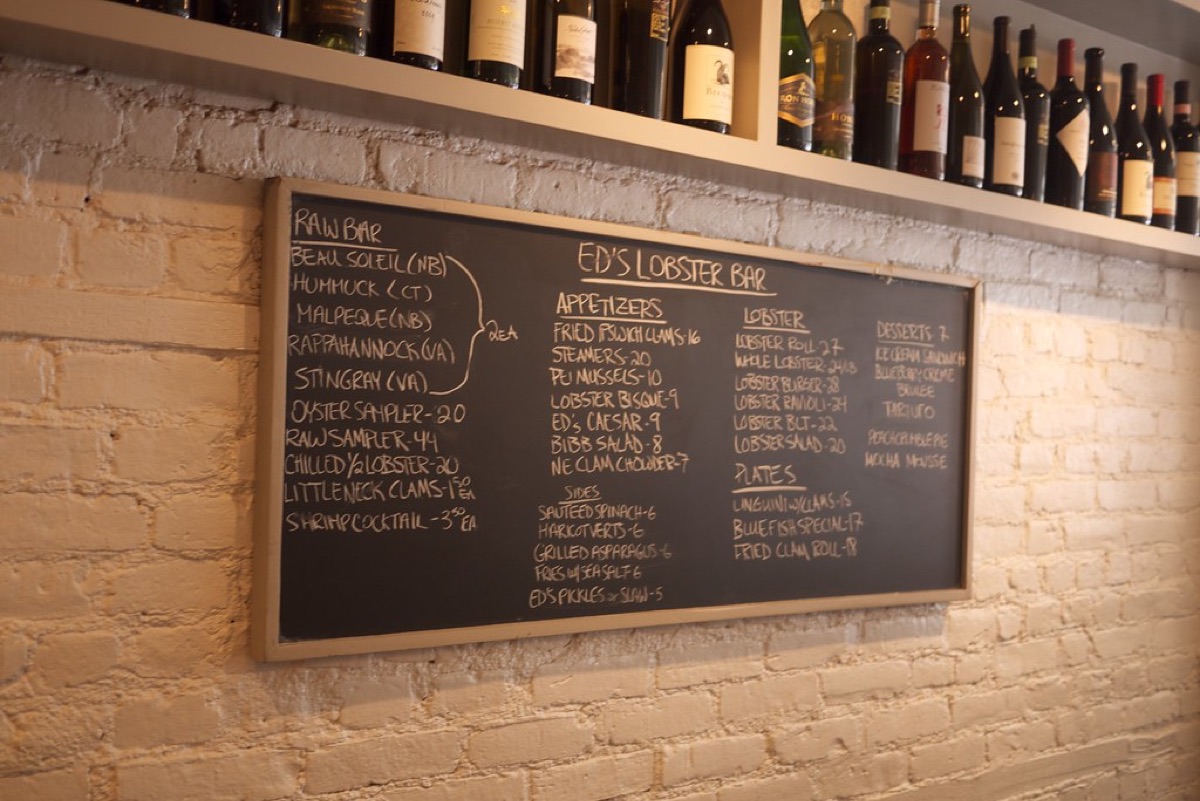
A menu has three jobs worth working on separately. The economics, which items to feature and how to price for margin, is menu engineering, covered in menu engineering and pricing. The words, how to describe a dish so it sells itself, are handled in how to write menu descriptions. This guide owns the third: the visual layout, how the page is scanned, where things sit, and how type and space make it feel expensive or cheap.
People do not read a menu top to bottom like a book. Menu-psychology research suggests that on a single page the eye settles near the middle first and works outward. On a folded or multi-panel menu the pattern becomes the classic golden triangle: the middle, then the top-right, then the top-left. The top-right in particular is prime real estate that many menus waste on a decorative header. Within any section, the first and last items get disproportionate attention while the middle goes half-seen. So put the dishes you most want to sell in those favoured spots, and let the workhorses fill the quiet middle. You are not tricking anyone; you are stopping your best dishes from hiding in the blind spots.
| Menu format | Where the eye lands first | Put your stars here |
|---|---|---|
| Single page | Middle, then outward | Centre of the page, first and last in each section |
| Folded or panel | Middle, then top-right, then top-left | Top-right panel and the head of each section |
| Digital or QR | Top of the category list | First categories and first items in the ordering flow |
How you show a price changes how much a menu earns. The worst common habit is a tidy right-hand column of prices, often with dot leaders running out to meet them. It looks organised, but it turns the menu into a spreadsheet: the guest scans down the numbers, finds the cheapest, and orders that, barely reading the food. The fix is to nest the price at the end of each dish description, in the same type size, with no bold figure and no currency symbol, so NZ$18 becomes a plain 18 after the last word. Dropping the dollar sign softens the sting of spending, and losing the dot leaders stops the eye being dragged rightward. Woven in at the same weight, prices get read after the appetite has formed, which is worth real money over a year of covers and costs nothing to change.
Near the top of a section, place one deliberately premium dish: the dry-aged steak, the seafood platter, the tasting option. Its job is to be an anchor, not a big seller. Once a guest has seen a NZ$52 plate at the head of the mains, the NZ$34 dish below it reads as sensible and the NZ$28 option feels like a bargain; without the anchor, that NZ$34 dish would have looked like the splurge. Keep it honest, a real dish priced to its genuine cost, and you have context rather than a con. It is the same lever we cover in how to increase average order value.
Visual emphasis works only when it is rare, so spend it once per section. One highlighted dish, marked with a light box, a small symbol, or whitespace around it, pulls the eye and lifts its sales; three competing highlights cancel out, because when everything shouts, nothing is heard. Typography follows the same discipline. Use two typefaces at most, one for headings and one for body, and keep section names short so the eye jumps between them fast. Above all, give the page room, because generous whitespace is the strongest signal of quality a menu has, and crowded menus read cheap no matter how good the cooking is. If a section feels tight, the fix is fewer items, not smaller type.
The object itself sends signals before a word is read. A larger menu tends to lower the felt cost of each dish, because the prices sit in more space, while a cramped card makes every number feel heavier. Material matters too: a wipeable laminate says casual and family-friendly, while uncoated paper or card reads considered and grown-up, so pick the one that matches your food. And a sticky, dog-eared menu undoes all of it, because to a guest the menu is the brand in their hands, and a grubby one implies a grubby kitchen.
Everything above applies on screen, with two additions. First, photos: on a printed dine-in menu heavy imagery usually cheapens the look, but online it is the opposite, and menu-psychology research suggests good photos move digital orders strongly, because the screen is your shopfront and people order what they can see. Second, category order is your layout: the sequence in the ordering flow is the digital version of section order, so lead with the categories that seed a bigger order. Treat your QR menu as the most-read document your restaurant owns, because for many guests it now is.
Where do people look first on a menu?
Menu-psychology research suggests eyes do not start at the top. On a single-page menu they tend to settle in the middle first, then drift outward, so the dead centre is prime space for something you want to sell. On a folded or multi-panel menu the pattern shifts to the classic golden triangle: the middle, then the top-right, then the top-left. Put your most profitable, most tempting dishes where the eye lands, not where habit says the list should begin, and let the workhorses fill the quieter middle of each section.
Should I line up all my prices in a column?
No. A neat right-hand price column is one of the most common menu mistakes, because it invites guests to scan straight down the cheapest number and order from there, ignoring the food entirely. Instead, nest the price at the end of each dish description in the same type size, with no currency symbol and no row of dots leading to it. That keeps attention on the words that sell the dish and treats the price as a detail, not a decision column. It reads calmer and typically nudges spend upward.
Do photos help or cheapen a menu?
It depends where. On a printed dine-in menu, heavy photography usually reads downmarket and clutters the layout, so most sit-down venues use words and restraint instead. Online it is the opposite: menu-psychology research suggests good photos move digital orders strongly, because a screen is a visual shopfront and people order what they can see. So keep print clean and text-led, and invest in real, appetising images for your online store and QR menu. Our guide to restaurant food photography covers how to shoot them well.
How many typefaces should a menu use?
Two at most. One typeface for headings and one for body copy is plenty, and many strong menus use a single family in different weights. Piling on a third or fourth font, or mixing several sizes and colours, makes a menu look busy and cheap and slows scanning right down. Restraint reads as quality. Spend your visual emphasis once per section, on a single box, mark, or pocket of whitespace, and let generous spacing do the rest. Crowded menus feel budget even when the food is excellent.
What order should menu sections go in?
Lead with the sections that seed a larger order and carry good margin, because the sequence is merchandising, not just a list. Openers such as starters and sides belong early, where they plant the idea of adding to the meal, and your high-margin mains should appear before guests feel committed. Drinks, sides, and add-ons deserve a visible spot rather than a footnote, since they lift the average check. On a digital menu the same logic applies to category order in the ordering flow: the first categories shape what gets added to the cart.
What is the single easiest menu win?
Cut clutter. If you change one thing, remove items and decoration until the menu breathes, because whitespace is what makes food read as considered rather than cheap. A shorter, cleaner list is faster to scan, easier to cost and prep, and quietly raises the perceived quality of everything on it. From there, place your two or three stars first and last in each section, drop the price column, and spend one piece of visual emphasis per section. Those four moves cost nothing and change how the whole menu sells.
Storefront, orders, kitchen, CRM and marketing in one place. Start free in a couple of minutes, no card needed. Pop in your email and we'll take you straight to setup.
Marketing when you remember to is not a plan. A restaurant marketing plan in four layers, with what to do weekly, monthly and seasonally.
Photos sell dishes the way a good waiter does. A one-hour food photography system for your phone: window light, three angles, ten frames a dish.
Opening night is a funnel, not a party. A restaurant grand opening that works starts weeks early: build the list, soft-open, then chase second visits.
Storefront, POS, kitchen, CRM, marketing. One login, one bill. NZ$1/month for the first 3 months.
Start free trial